IBM · Cloud Pak for Data
Notification System
One notification pattern across Cloud Pak for Data
Background
Cloud Pak for Data is an extensible platform built on microservices that lets different personas across an organization collect, organize and analyze their data.
Notifications are messages that tell users what is happening.
Impact
After six months of work and many iterations, the notification system was implemented across Cloud Pak for Data. The pattern also went beyond Cloud Pak for Data: it was contributed to IBM’s Carbon design system, for use across IBM products.
Problems
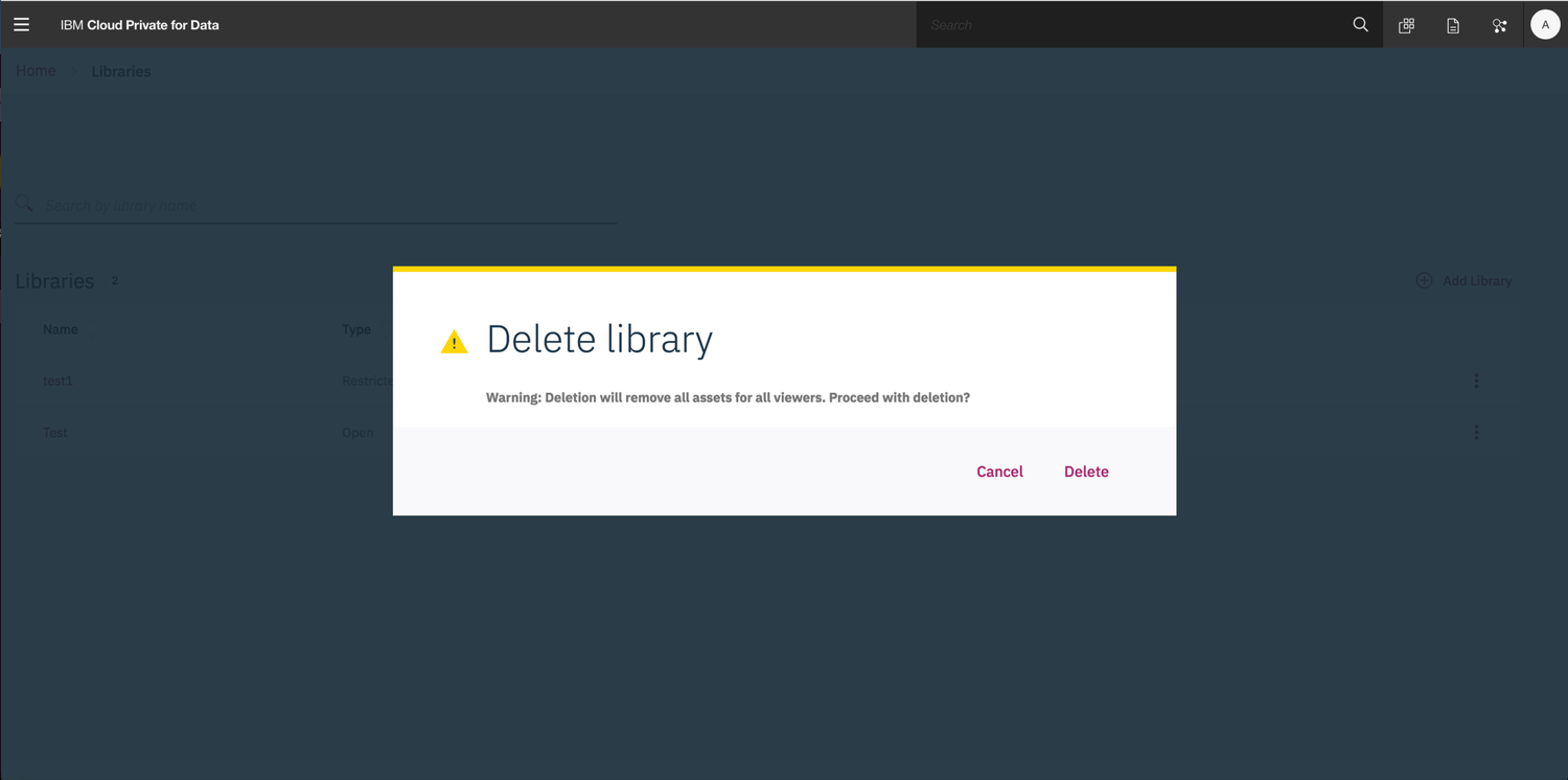
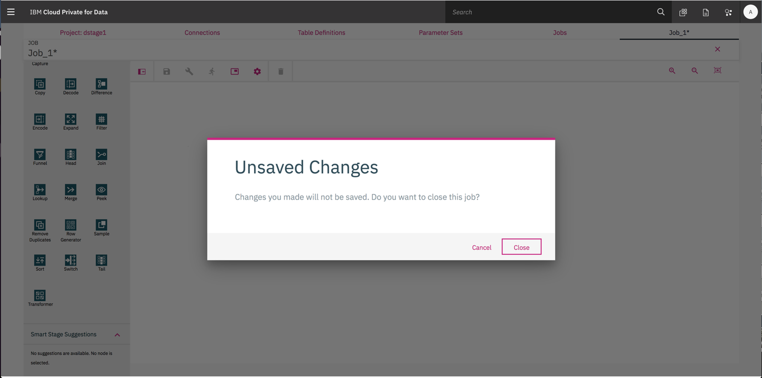
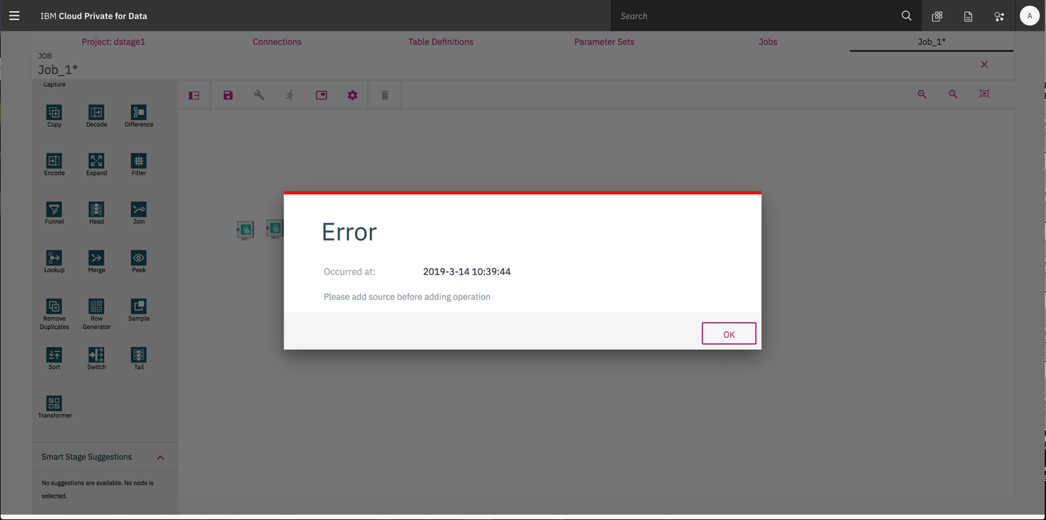
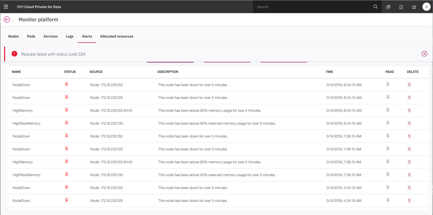
- The meaning was hard to understand
- The definitions were unclear
- Services had different notification processes, so they weren’t consistent with each other
- Notifications didn’t follow the Carbon design guidelines
Design goal
Cloud Pak for Data end users can understand which events occurred, and when, across all the offerings relevant to them, so they can reduce downtime and increase productivity. We needed a design that let users easily see what had happened in the system and, more importantly, which issues they needed to solve right away.
Process
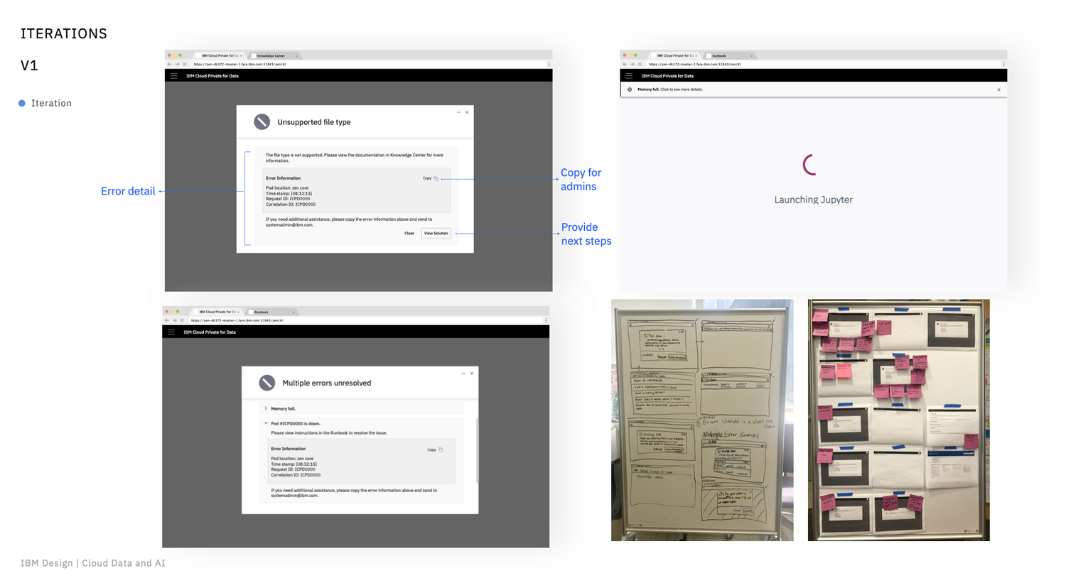
The first version
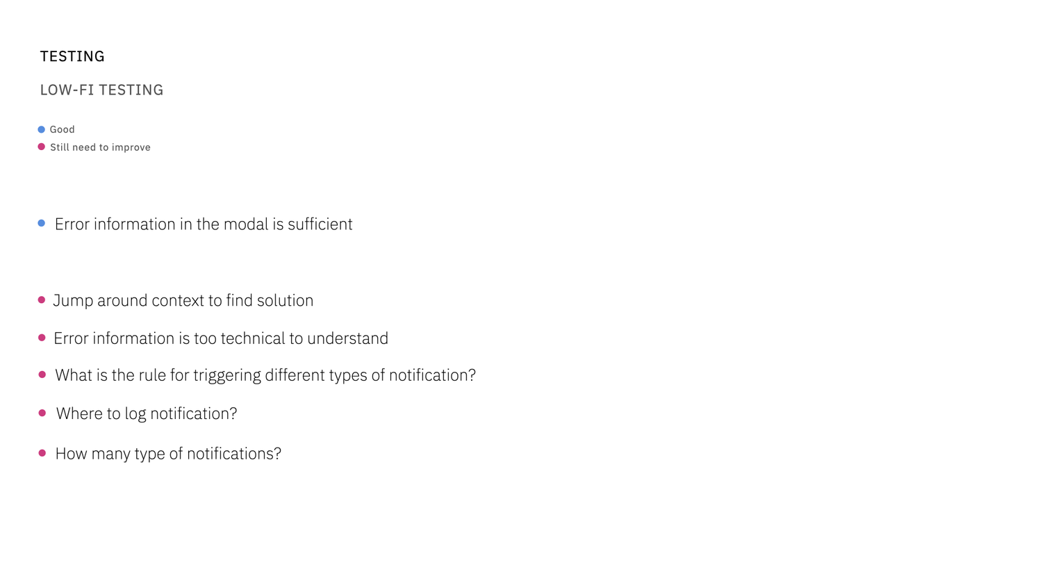
In the first version, we focused only on the modal design and tried to work out how to show error information in it. That led to some conceptual issues, which we found during low-fi testing.
Second version
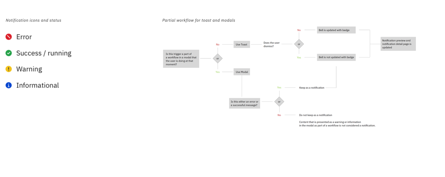
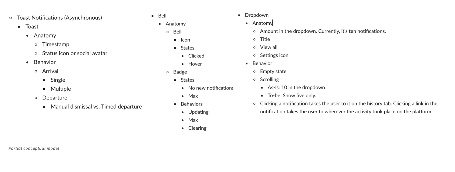
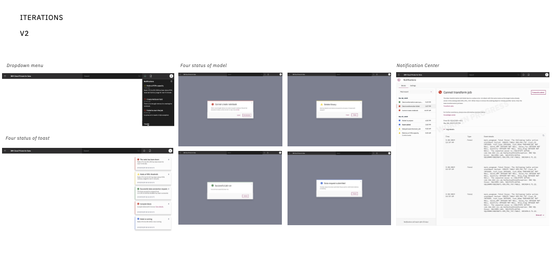
Because of the issues found in the first round of testing, the team stepped back to check the current definitions of notification types and statuses, and revisited our notification documentation. At this stage we defined the icons and statuses, the workflow for triggering notifications, and the conceptual model of a notification. Then I iterated the design into a second version.
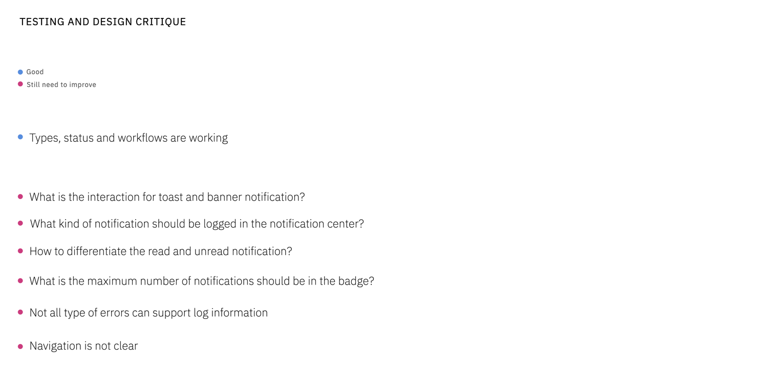
With the second version, we ran a second usability test, presented the design to stakeholders, and gathered feedback for the next iteration.
Third version
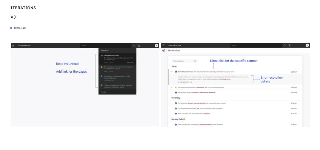
In this version I added more design detail. Clicking the bell icon in the header opened the notifications dropdown and cleared the numbered badge. The dropdown showed the five most recent notifications, with a “View all” link to the Notifications page, and we distinguished read from unread notifications. The notification center held the full history, newest first, with a find box for quick searching; some notifications could be expanded to show more detail and a direct link to the page where the error happened.
Final version
We brought the whole design in line with the Carbon design system guidelines.
Next steps
- Inline notification
- UI in the dark theme v.s white theme
- Multiple notifications
- Confirm the pattern’s visuals meet accessibility standards and guidelines
Learning
Listening is key when talking to service/external teams.
- Don’t rely on a static formula (a Mural board or box template) to request deliverables
- Ask the right questions so teams speak up about what they can do (a fluid conversation)
- Position yourself as an equal collaborator, not a requester.
Leverage existing work instead of reinventing the wheel.
- I looked at notification design across IBM products and reached out to those teams
- I found good examples and adapted them to the project’s needs